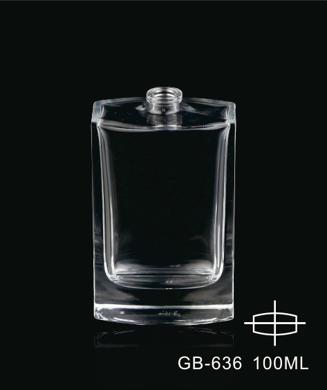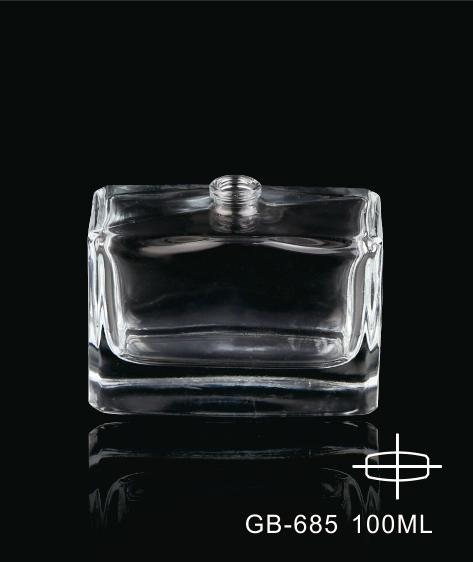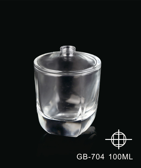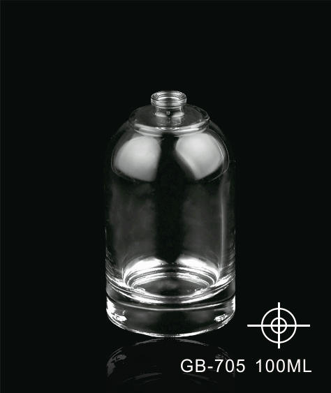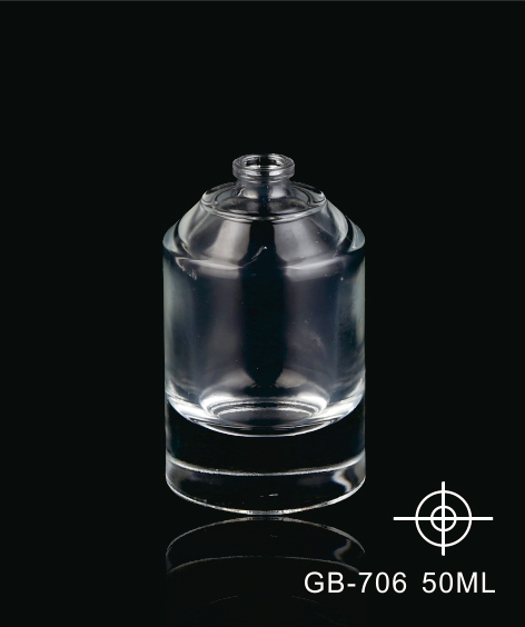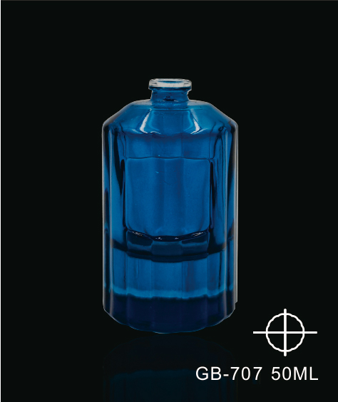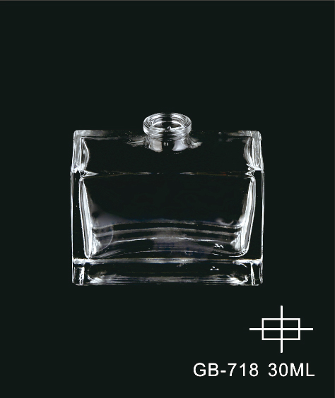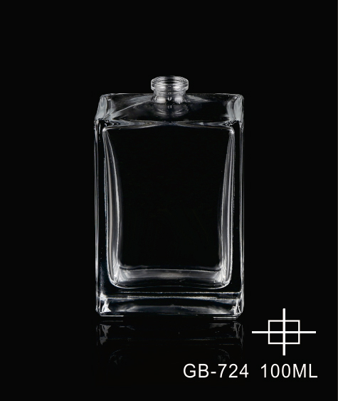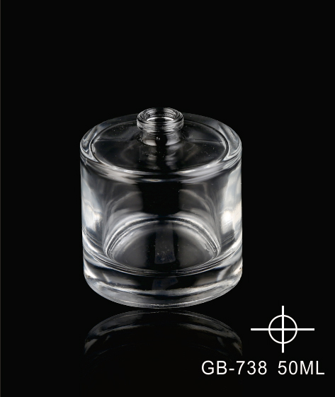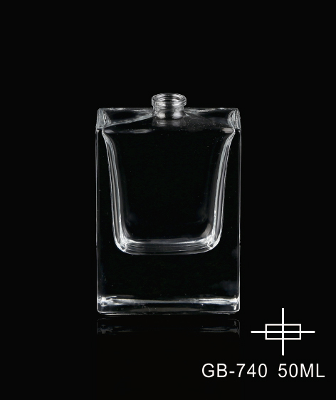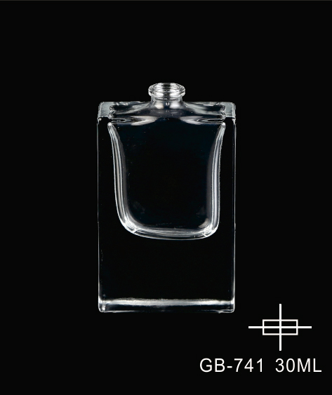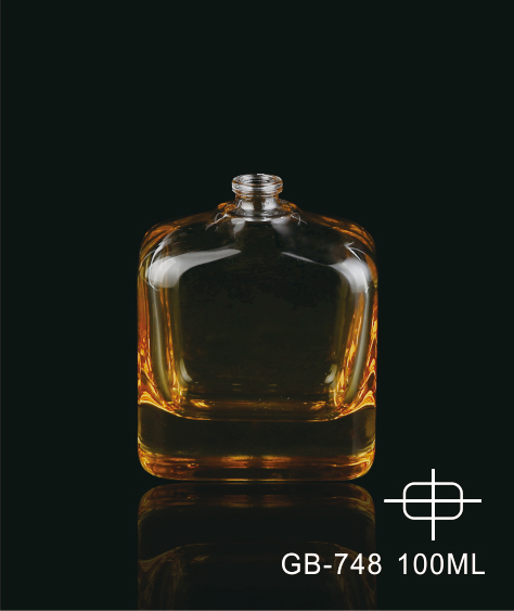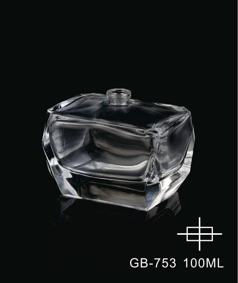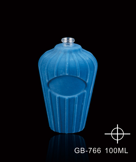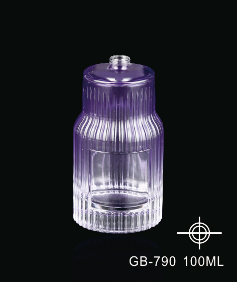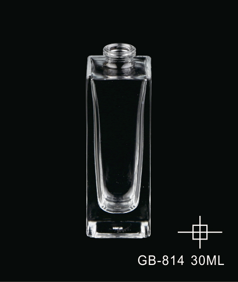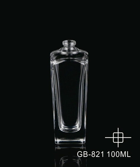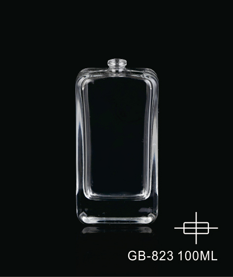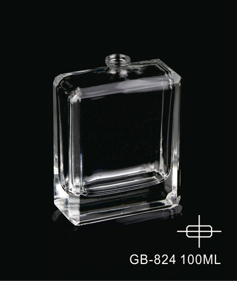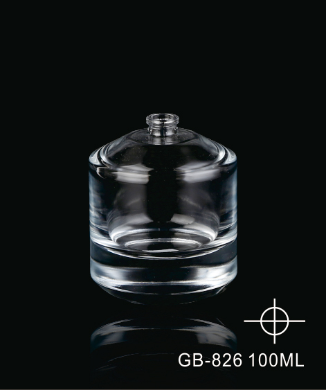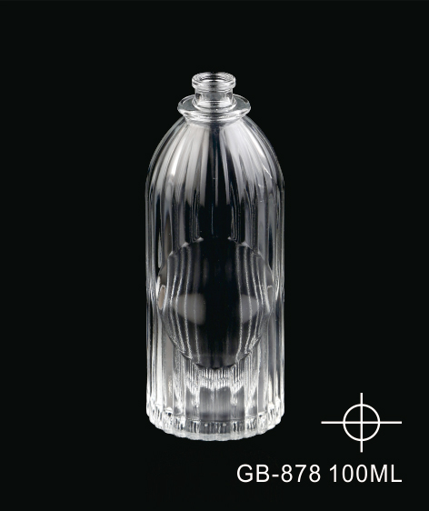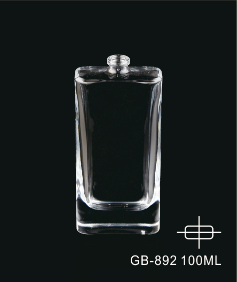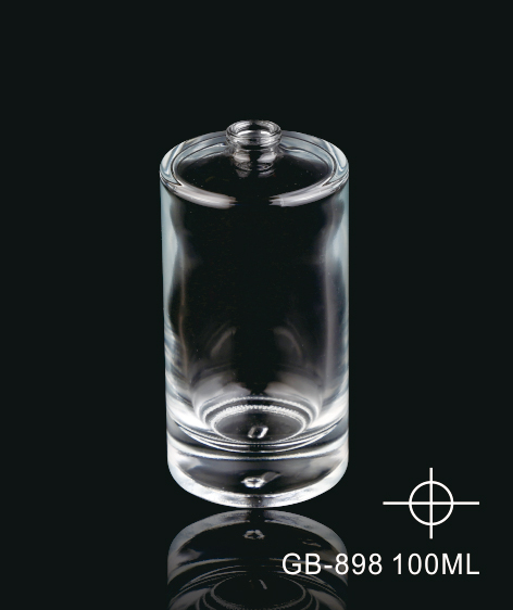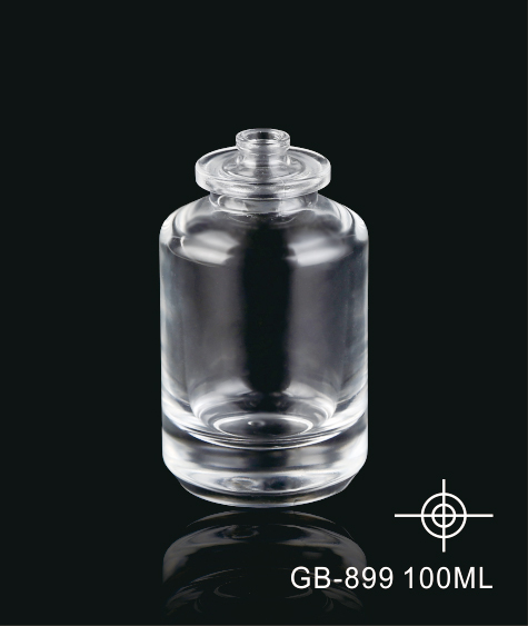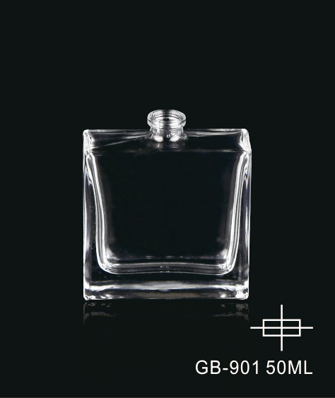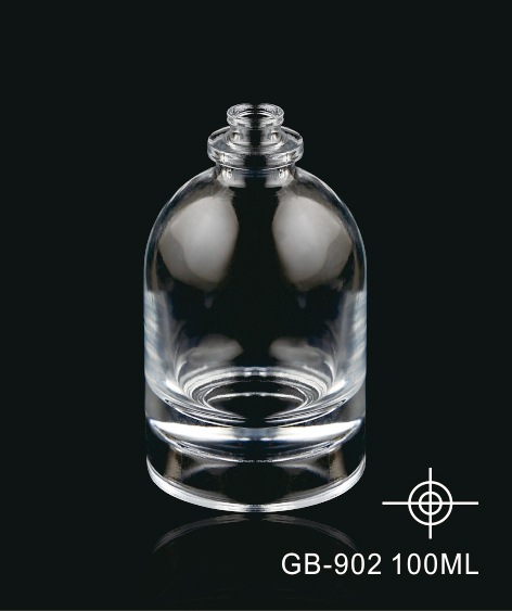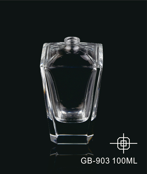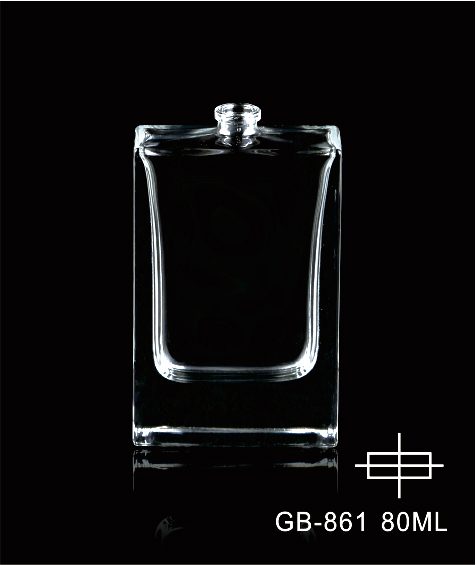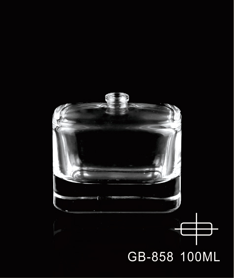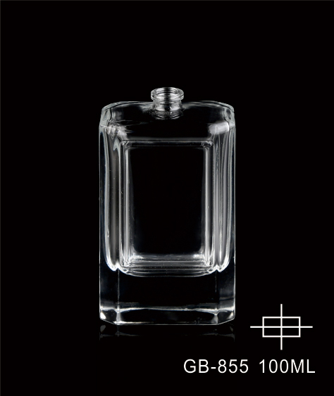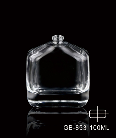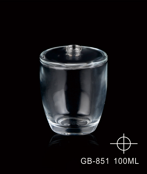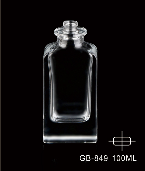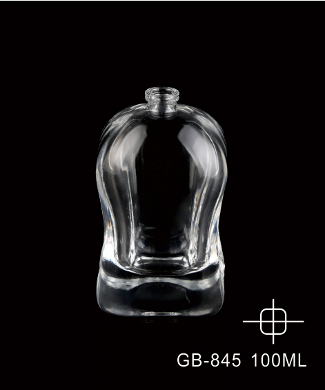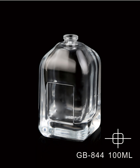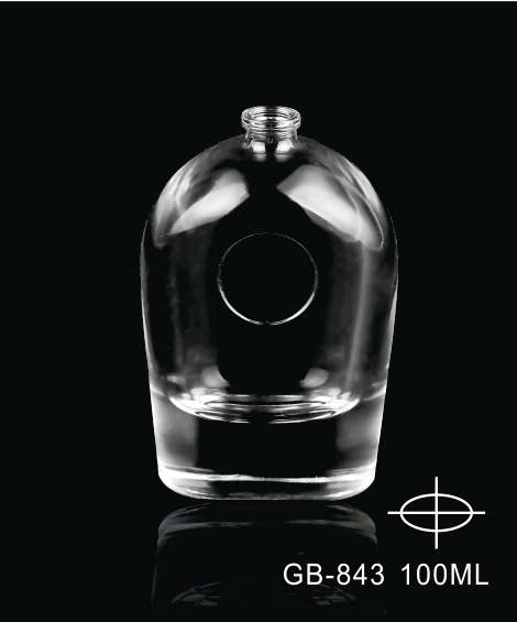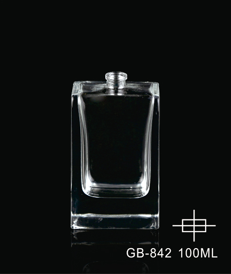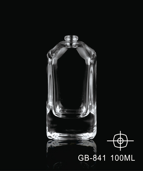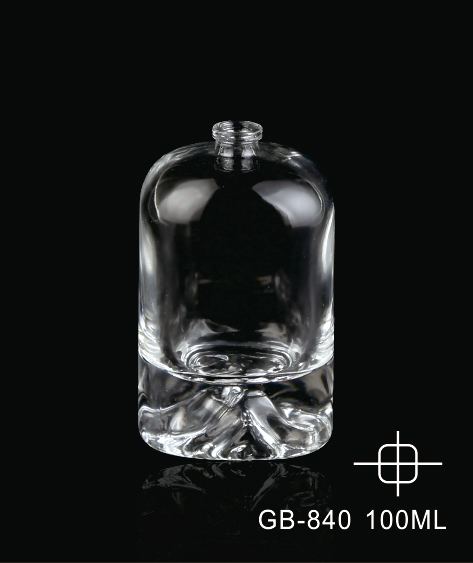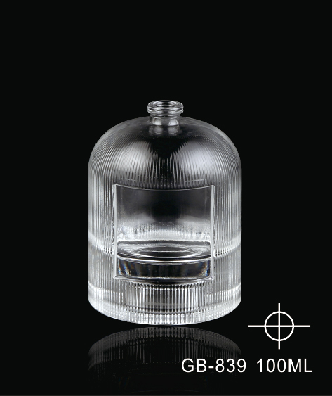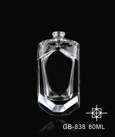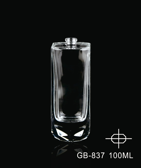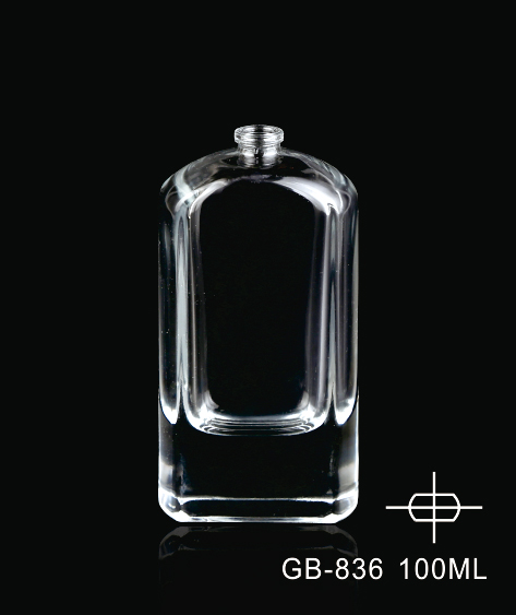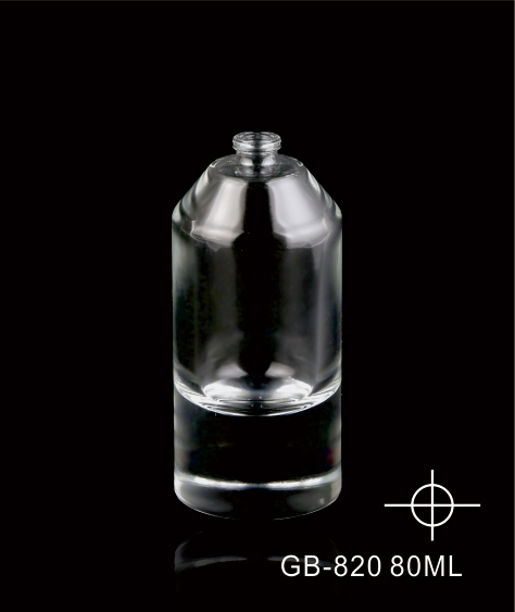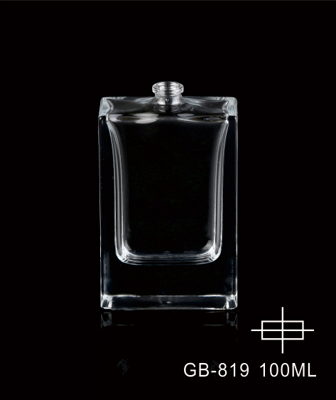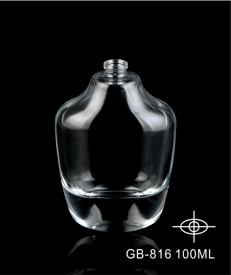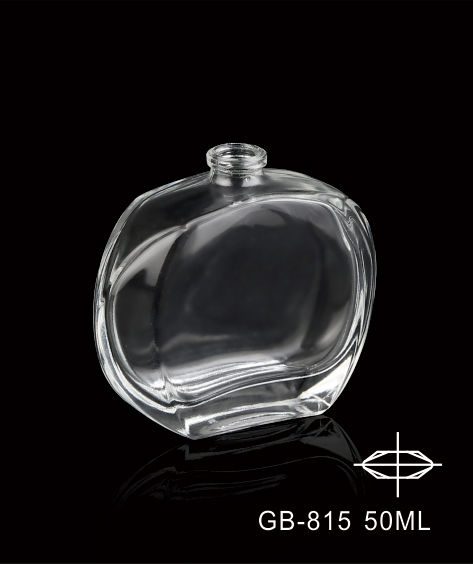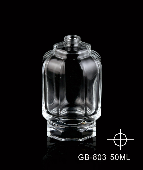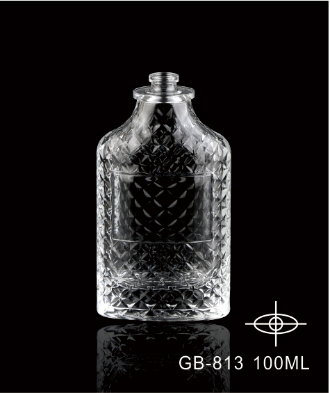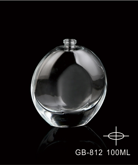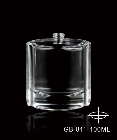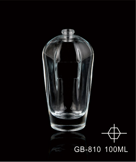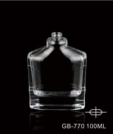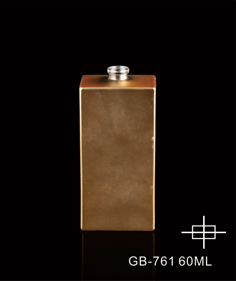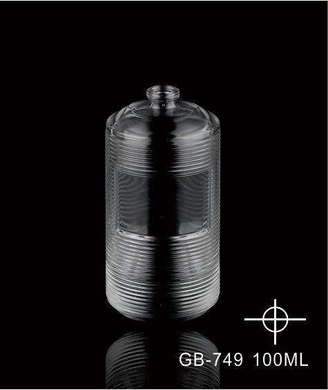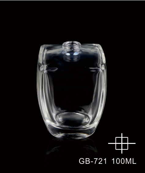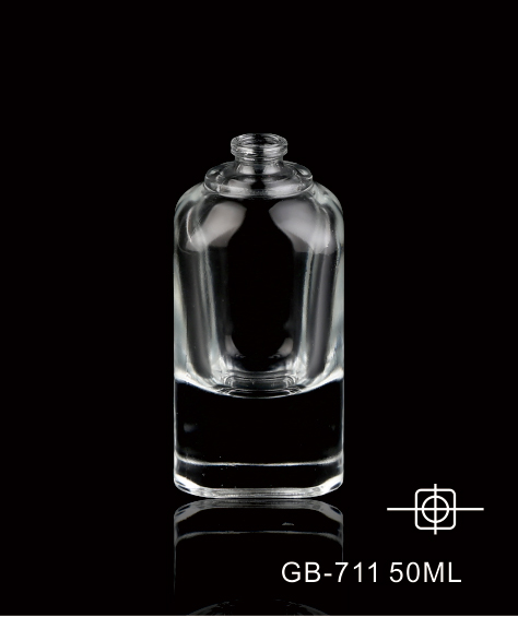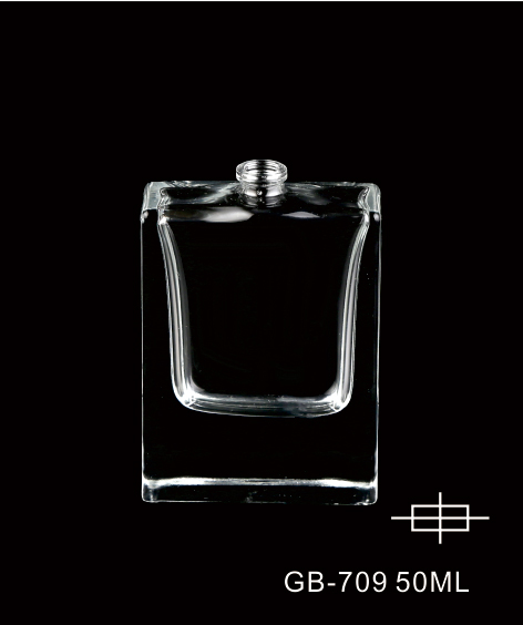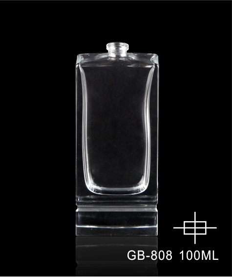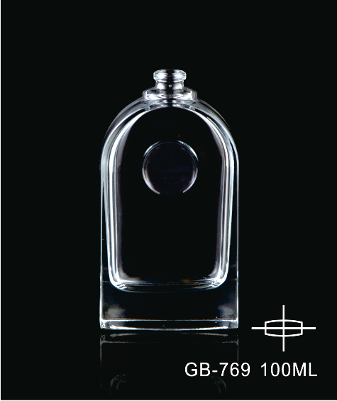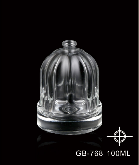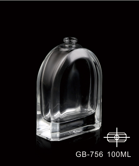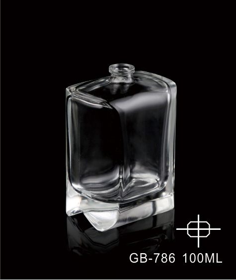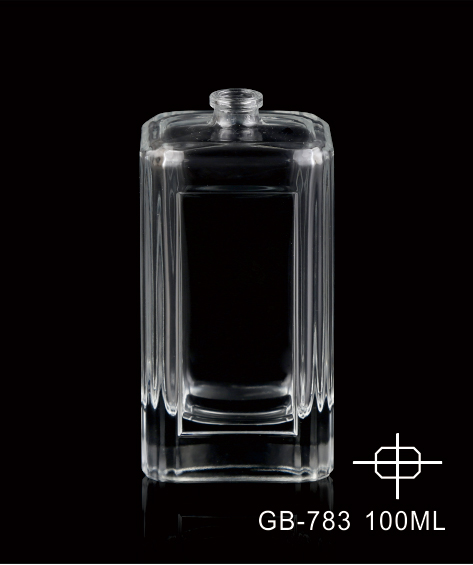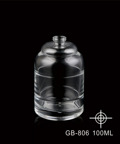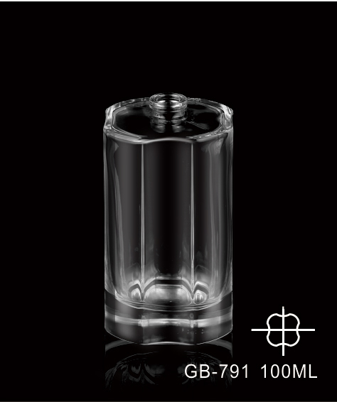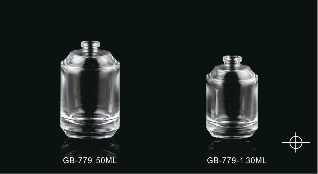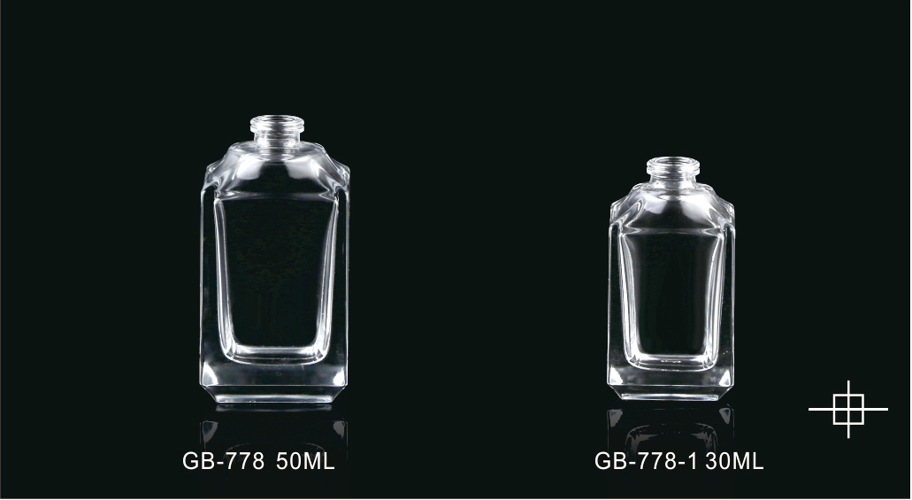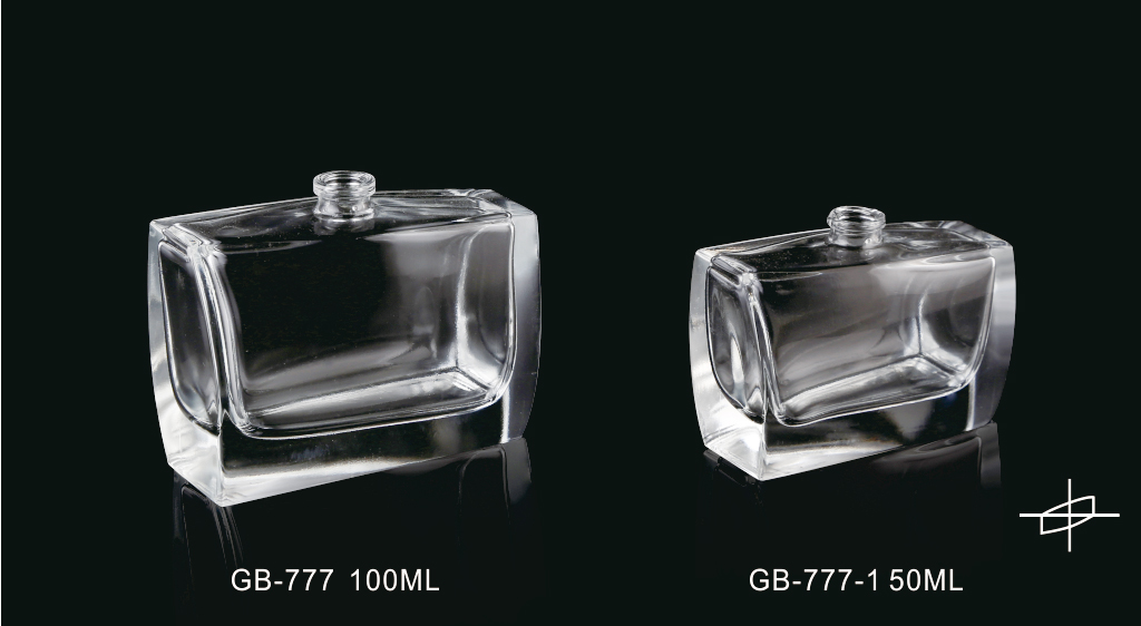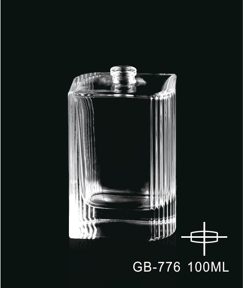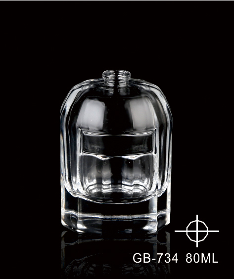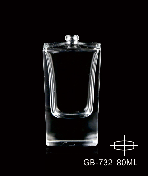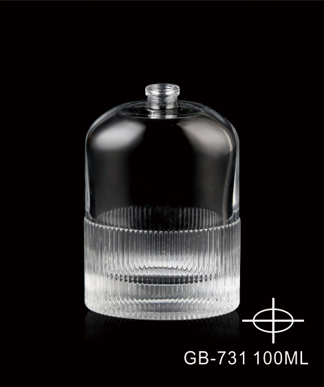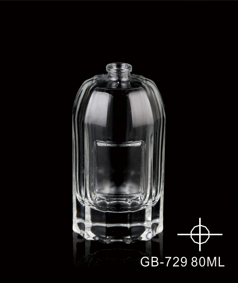
Nowadays, the overall design trend of fragrance bottles in the market is towards simplicity and lack of decoration. Through the analysis of several classic perfume brands, this article specifically examines the application of decoration-free design style in fragrance bottles from the aspects of shape association, color association, and symbol direction, analyzes the aesthetic taste of decoration-free design style in fragrance bottle decoration design, explores the charm of simple, direct, and personalized decoration-free design style, and proposes that fragrance bottle packaging design should follow the trend of the times and advocate the concept of decoration-free design.
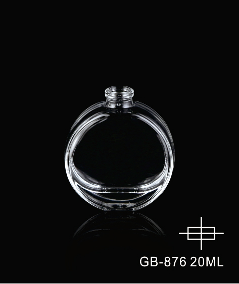
The uniqueness of this empty fragrance bottle lies mainly in its curvaceous design resembling a woman's body. The bottle is a slender-necked round bottle with a golden neck ring at the neck, a small circle at the top, and an oval at the bottom. The entire bottle body is composed of the forms of a small circle, neck, and oval, and the perfect arc design interprets the elegance and softness of women. Glass is the material, with gold as the main color, strong and gentle, noble and delicate. The bottle body has no decorative text. Through the simple and perfect curve design, it effectively reflects the inseparable relationship between women and perfume.
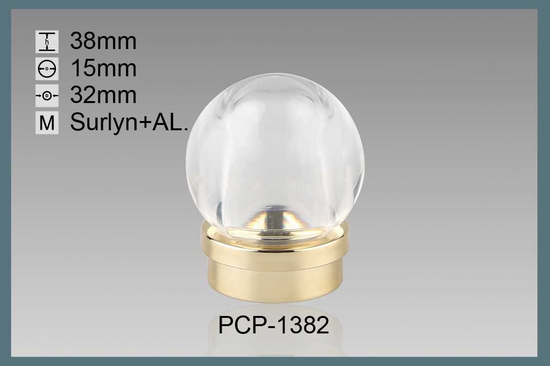
The shape of a fragrance bottle is a 360-degree sphere, like a forming ball of life in the universe. In the center is an engraved cone-shaped pattern, with red light shining from within, symbolizing a transparent ice ball with a hidden red flame, giving people a visual feeling of calmness and passion, full of contrast and consistent with the theme of "One Life Fire". This work uses a new design material, PCTA, which has a gentler and more transparent texture than glass. Through cutting, carving, grinding, pressing, and other techniques as well as advanced surface treatment processes, it creates a rich texture, and the fire red color appears more realistic, making people think of burning flames, perfectly matching the brand theme.
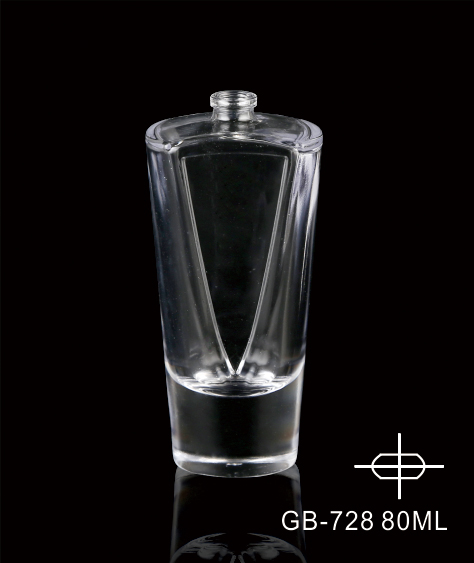
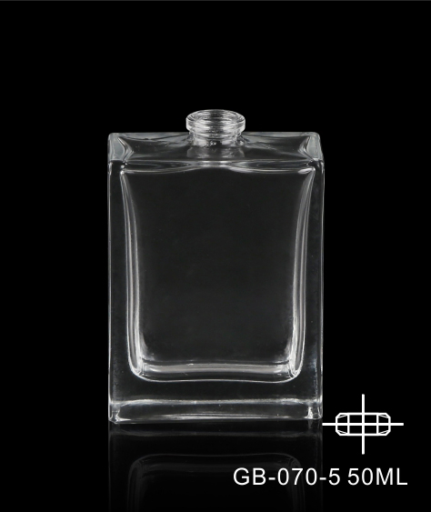
The bottle body of the perfume has no textual information, is transparent in color, and is simple and generous in shape. The material is smooth glass, but the bottle wall is processed into an "M" and "W" shape by sandblasting, which happens to be the abbreviation of the English words "Men" and "Women", respectively. The designer cleverly implied and conveyed the product's target audience information through this symbol. In addition, the "V" shape separated by transparent and frosted glass is perfectly in line with the brand name, replacing the function of explanatory text and better highlighting the brand name.
This perfume is a series of perfumes composed of two fragrance bottles. The designer uses different colors to distinguish a complete cube into a polyhedron and a small square. The body of the small square bottle can be embedded in the polyhedral body, and the polyhedral body can completely wrap the body of the small square bottle. The combination of the two bottle bodies once again forms a complete cube. The designer cleverly gave people a sexual innuendo through the combination of disassembly and reconstruction without any indicative text, allowing consumers to easily distinguish this as a couple's perfume and quickly distinguish the target audience information. This fragrance bottle design is highly personalized and easily catches consumers' attention, making it stand out from similar products and leaving a deep impression, while satisfying the sales function of the product.
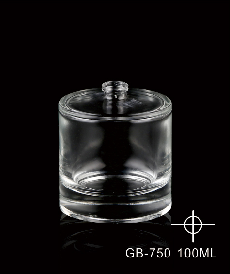
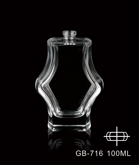
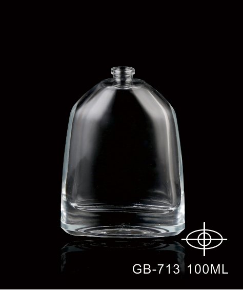
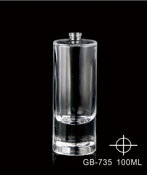
Through the analysis of the above fragrance bottles, the advantages of decoration-free design style in product design are summarized. Today, as human society enters the new century, it is particularly important to lead current packaging design with what kind of design concept in the face of the reality of resource waste, energy shortage, and environmental degradation. Decoration-free design is not a vague rejection of decoration, but to abandon the pure decorative bondage of products, to fully utilize the unique display of form in each three-dimensional package and the material beauty of the material itself, and to maximize the simplicity and personalization of design. The simple and unique design language embodied by the decoration-free design style conforms to today's aesthetic standards and follows the social concept of sustainable development. It deserves everyone's recognition and praise.

 0086-571-89936696
  david@bi-packaging.com
 19TH FLOOR, BUILDING 3, CHUANG MEI HUA CAI CENTER, WEST LAKE DISTRICT, HANGZHOU, ZHEJIANG
  0086-571-89936696
  david@bi-packaging.com
 19TH FLOOR, BUILDING 3, CHUANG MEI HUA CAI CENTER, WEST LAKE DISTRICT, HANGZHOU, ZHEJIANG
  English
 日本語
日本語 한국어
한국어 français
 Deutsch
 Español
 italiano
 русский
 português
 العربية
 Nederland